Pharmacy Looks
The window gets a crisp logo mark, often with a cross or health symbol, so patients find the entrance at a glance. A small interior accent reinforces the brand at the counter.
Clarity beats spectacle; a sharp, static mark communicates trust.
Pharmacy Checklist
- Crisp logo and health-symbol gobo.
- Clear, neutral white balance.
- Window and counter marks.
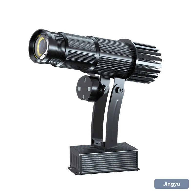
- Small, low-noise unit.
- Plug-and-play setup.
Pharmacy Comparison
| Spot | Unit | Power | Throw |
|---|---|---|---|
| Window | 15 to 50 W | 15 to 50 W | 2 to 5 m |
| Counter | 15 W logo | 15 W | 2 to 4 m |
| Entrance | 50 W logo | 50 W | 3 to 6 m |
| Drive-through | IP65 logo | 50 W | 3 to 8 m |
Trust Through Clarity
Keep the mark sharp and the colour neutral. A pharmacy window should signal care and competence, not a light show.
Brightness for Pharmacies
Pharmacies are brightly lit; 50 W holds a window mark. Counter accents stay subtle at 15 W.
Mistakes
- Busy pattern undermining trust.
- Colour mismatch with brand.
- Weak window mark lost in light.
- Beam across the counter.