Gallery Uses
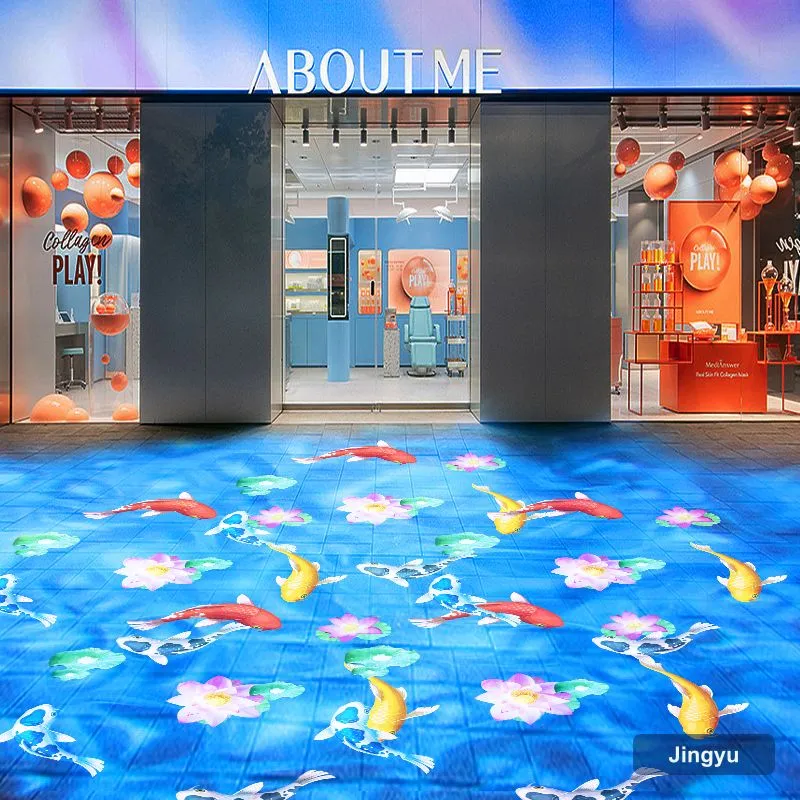
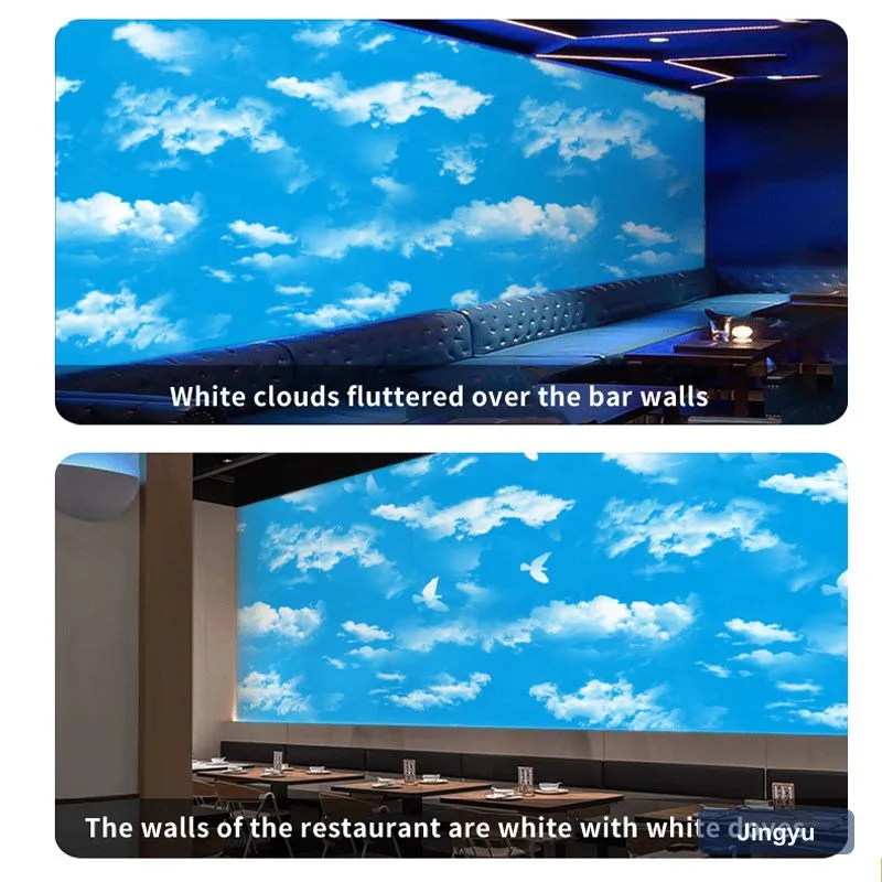
The entrance wall carries the gallery name, doorways get wing labels, and a soft pattern near the floor guides flow. All of it lives on matte architecture, never on the art.
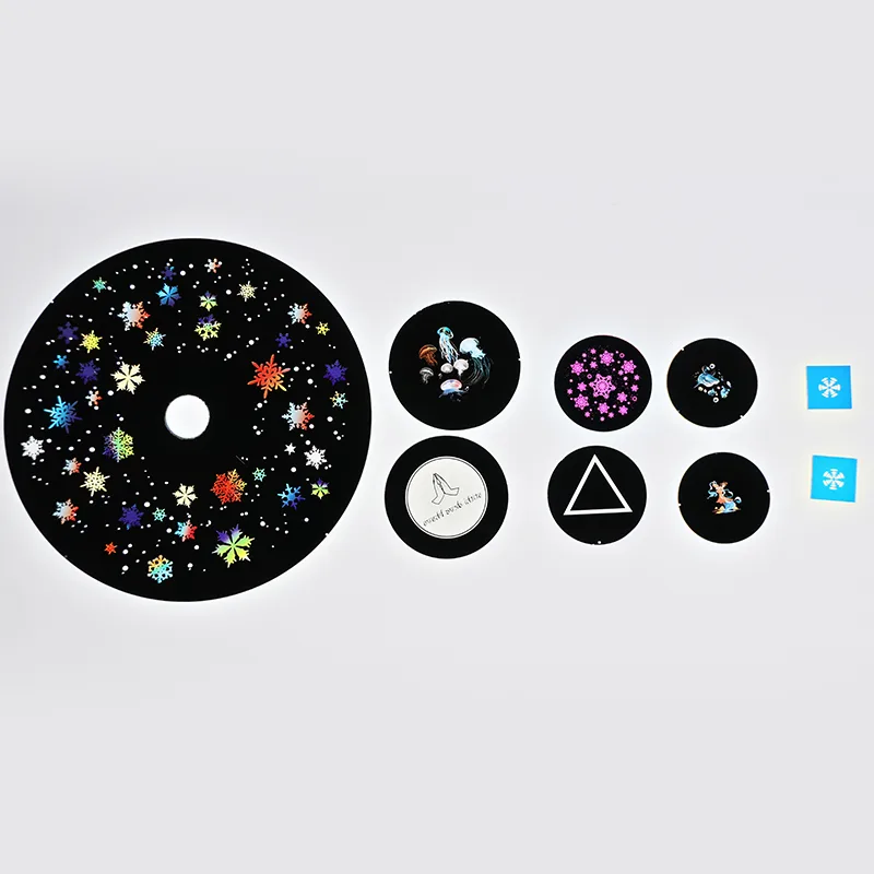
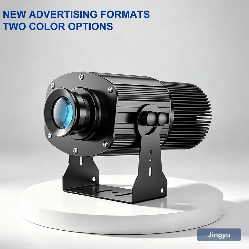
A high-quality lens keeps edges clean so the mark looks intentional, not improvised.
Gallery Checklist
- Precision lens for clean edges.
- No glare: aim at matte walls only.
- Low noise for quiet rooms.
- Warm, art-safe LED light.
- Subtle brand presence.
Gallery Comparison
| Use | Unit | Power | Placement |
|---|---|---|---|
| Entrance name | 50 W logo | 50 W | Wall 4 to 8 m |
| Doorway label | 15 W logo | 15 W | Doorway |
| Floor flow | 15 to 50 W | 15 to 50 W | Floor 3 to 6 m |
| Outdoor sign | IP65 150 W | 150 W | 10 to 20 m |
Avoiding Glare
Never project onto glazed frames; the reflection defeats the art. Use matte walls and labels, and keep the beam shallow so it does not wash across neighbouring works.
Brightness for Galleries
Galleries are carefully dim; 15 to 50 W reads clearly as accent or label. Power is not the point, precision is.
Mistakes
- Glare on framed works.
- Beam across the art.
- Audible fan breaking quiet.
- Over-brand dominance on white walls.