Cafe Looks
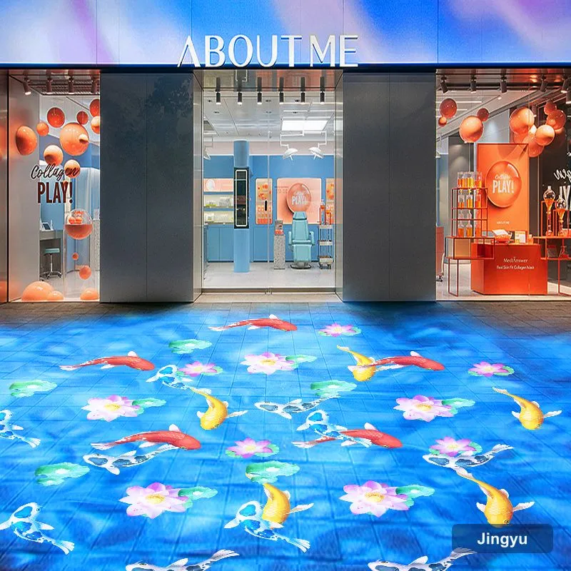
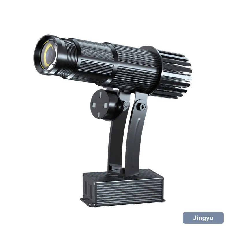
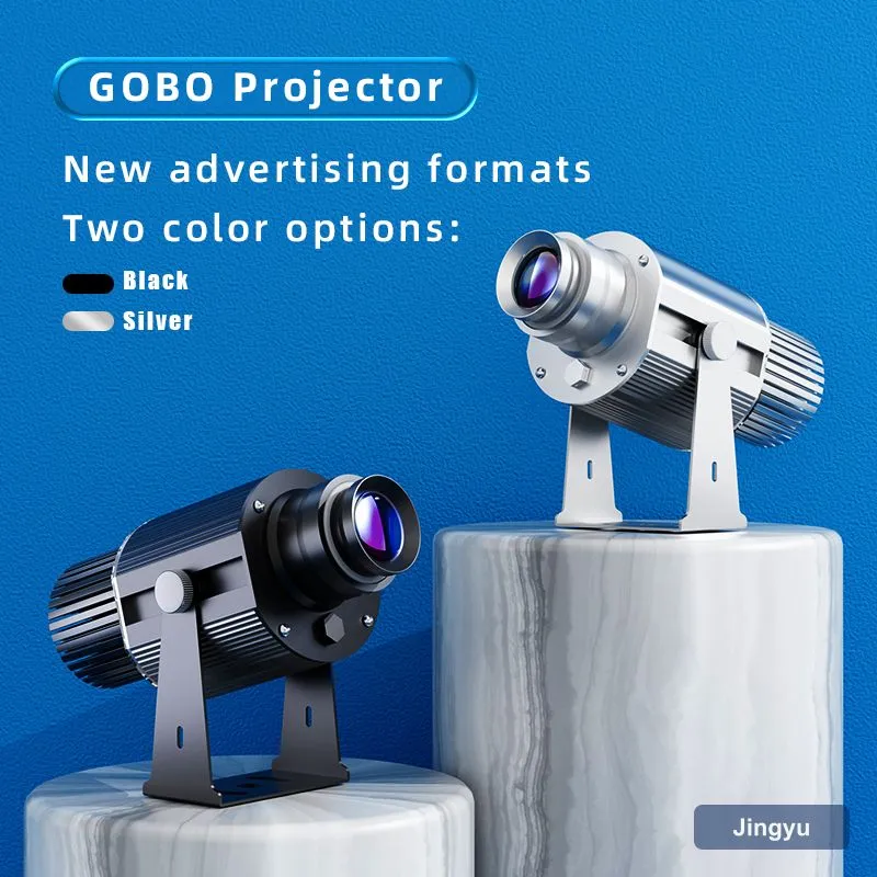
The classic cafe look is the logo on the wall behind the espresso machine and a soft mark in the window for passers-by. Because the space is small, a compact low-power unit is perfect.
Warm white and a short throw keep the mark intimate and readable from the queue.
Cafe Checklist
- Small 15 W logo unit for counters.
- Warm white for a cosy feel.
- Window gobo for street presence.
- Plug-and-play, no installer.
- Low noise near customers.
Cafe Comparison
| Spot | Unit | Power | Throw |
|---|---|---|---|
| Counter wall | 15 W logo | 15 W | 2 to 4 m |
| Window | 15 to 50 W | 15 to 50 W | 2 to 5 m |
| Outdoor seating | Rechargeable | Battery | 3 to 6 m |
| Feature wall | 50 W logo | 50 W | 4 to 8 m |
Window vs Interior
An interior mark builds brand for people already inside; a window mark pulls new customers from the street. Many cafes run both on a timer.
Brightness for Cafes
Cafes are moderately lit and warm; 15 W covers a counter wall, 50 W a brighter window. Overpowering a cafe kills the mood.
Mistakes
- Cold white in a warm space.
- Beam across the seating area.
- Too-bright mark feeling like a shop.
- No window plan for street pull.